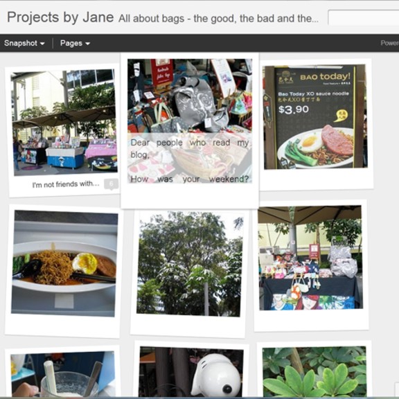
Have you heard? Blogger now provides seven dynamic views for your blog. What does that mean? It means that a reader now has the option to view a Blogger blog content in seven different ways. That is, if the blog owner has enabled the dynamic view ability. Right now, I have not enabled the dynamic view for a few reasons which I'll go into later. But I'll give you a preview of what my blog could look like in future. Yes, sort of like a crystal ball.
But before that, dynamic views only work if:
- Your blog is public. Meaning no sign-in.
- Your blog feeds are fully enabled. In the Settings | Site feed tab, you have enabled either Full or Jump Break for your Post Feed.
Here's the preview of the seven views of my blog:
 |
| Classic View |
The classic view is pretty much what you're used to already. Except for one very important extra - infinite scrolling. Infinite scrolling means scrolling through the pages without having to click on a page or "older posts". And even after clicking on a specific post, infinite scrolling is still possible because you are really looking at one big giant page.
 |
| Flipcard view |
 |
| Magazine view |
 |
| Mosaic view |
 |
| Sidebar view |
Sidebar view looks promising. However infinite scrolling only works on the sidebar. I'm getting obsessed with infinite scrolling!
 |
| Snapshot view |
 |
| Timeslide view |
What do you think of the seven dynamic views? Which ones do you like? One other thing you probably didn't get from the images of the above views is this: The reader gets to choose the view. It's totally in her control.
If you own a Blogger blog and would like to preview the dynamic views of your blog, you can go here to enter your blog name and it's totally safe, no worries. Look for the word "Preview".
Before you excitedly go off to enable dynamic views for your Blogger blog, let me tell you the reasons why I haven't done it for mine.
- The sidebar disappears along with all my ads and widgets.
- The header looks different and my header ad disappears.
You know what I wished Blogger had done instead? Allowed the blog owner the option to limit the views for her blog. I really like to have control over what the reader sees. Of the seven views, I believe most of my readers will just use Classic or, Sidebar. Those new to my blog might go for Timeslide.
p.s. If you're enabling dynamic view for your blog, I beg you - please keep a copy of your BEFORE template. At least if you don't like your new look, you can always revert.
hmm you're so tech savvy! i've not even read about this seven different views yet! In my opinion, they're trying to be like tumblr with the mosaic/snapshot layouts. But i'm not very impressed. I can be quite resistant to change sometimes, unless there is a VERY strong push-pull factor...
ReplyDeleteIf I could keep what I have and add infinite scrolling it would be perfect... I kind of like my widgets and don't want to lose them.
ReplyDeleteThanks for explaining this! I had no idea theses changes were about to happen. All I wish is that one day Blogger will allow us to answer to comments by asking the readers to give their e-mail when they write one - as it happens on the other plaforms.
ReplyDeleteAs for the view choices, I am actually not sure about any of these... Will people still take the time to read when all they see are photos? Will they really "read further"? I am not sure. I know I often don't...
I must admit I don't like change if things were left up to me the wheel wouldn't have been invented. I do like the idea of the infinite scroll. I enjoyed reading the story of your market days what a hoot, think you may have fallen asleep Alice in Wonderland style as me thinks it may be a tad impossible to smoke a cooking pot.
ReplyDeleteLaurie Freeman
I must admit I'm mostly resistant to change. I do like the infinite scroll feature but I wouldn't be wanting the mosaic type photos. Like 'by night'^ I'd be worried that people would just look at the photos and not bother reading further.
ReplyDelete